
George W. Hammond, Ph.D.
Director and Research Professor, EBRC
Location plays an important role in our lives. Just ask your friends in the Northeast that battled mountains of snow for much of the winter. In addition, changing locations is costly. It can involve hiring moving vans, recruiting friends/family, sometimes driving long-distances. It can also disrupt or re-establish long-standing work and family ties.
One consequence of that fact is that people carefully consider migration decisions. They tend to spend a great deal of time gathering and weighing information about possible destination locations before making a move. This information might pertain to climate, economic opportunities, crime rates, etc.
Thus, migration decisions contain a large amount of information about the overall “quality of life” or “standard of living” of locations.
This implies that we can use domestic migration data from the U.S. Census Bureau to rank states based on their “quality of life,” from the perspective of individuals moving around the U.S. A methodology to accomplish this ranking was established by Douglas (1997)1.
While the underlying justification is complex, implementing the methodology is quite simple. We focus on pairwise comparisons of gross migration flows across states in order to compute an overall win/loss record for each state versus all other states. This approach has the advantage of fully exploiting information contained in the state cross-migration matrix, in contrast to other approaches such as ranking by the overall net migration rate.
Exhibit 1 illustrates the approach using gross migration flows from Census 2000. These flows are measured from 1995-2000. During that period, 92,452 Arizona residents moved to California. However, 186,151 California residents moved to Arizona. We classify this as a “win” for Arizona versus California and post a +1 in Arizona’s win/loss record. In contrast, during the 1995-2000 period, 9,304 Arizona residents moved to Georgia, while 8,739 Georgia residents moved to Arizona. In this case, Arizona “loses” to Georgia and we post a -1 in Arizona’s win/loss record. And so on until we have a complete win/loss record for Arizona versus all states. The sum of Arizona’s “wins” and “losses” is the state’s overall score.
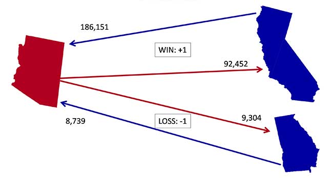
Exhibit 1: Estimating Relative “Quality of Life” with Cross-Migration Data
(Census 2000)
In the end, we will rank states based on their global win/loss record. States with more “wins” are ranked higher than states with more “losses.” We will break any ties (or intransitivities) that emerge based on “head-to-head” results or a slightly more complex procedure if needed. See Douglas (1997) for more on this.
Using this methodology we rank states based on their relative “quality of life” using decennial Census data for 197, 1980, 1990, and 2000. We also present results using the American Community Survey (ACS) five-year estimates for 2005-2009 and 2008-2012. The results of all of these rankings are summarized in Exhibit 9, below. Results for 1970, 1980, and 1990 are from Douglas (1997). Results for 2000, 2005-2009, and 2008-2012 are constructed by the author, with the assistance of Dan Kinnear, and Arthur Dai. Keep in mind that the decennial Census data is very different from the ACS data. For instance, the migration data from the decennial Census tells us about flows over a five year period. Thus, the 1970 Census asked survey participants about their state of residence five years ago, or 1965. The ACS asks survey participants about their state of residence one year ago. In addition, the ACS five-year estimates are based on a rolling sample and, overall, the sample size for the ACS is smaller than that for the decennial Census.
Exhibit 2 shows the rankings by quintile for 1970. Note that states in the West and the South rank relatively high, while states in the Northeast and Midwest rank lower.
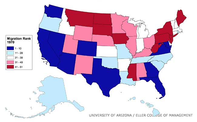
Exhibit 2: State Rankings by Quintile, 1970
(Census 1970)
Exhibit 3 shows the ranking for 1980. California slides down from the top quintile into the second quintile, but in general states in the West and South rank higher than states in the Northeast and Midwest.
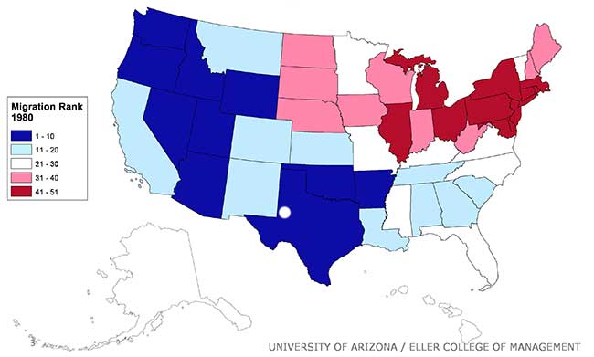
Exhibit 3: State Rankings by Quintile, 1980
(Census 1980)
Exhibit 4 shows the ranking for 1990. Now Texas, Oklahoma, and Louisiana drop from the first and second quintiles down to the bottom quintile. This reflects the dramatic drop in gasoline prices during the last half of the 1980s. States in the West still rank high, but it is the states in the Southeast that really shine. States in the Midwest and Northeast still rank relatively low.
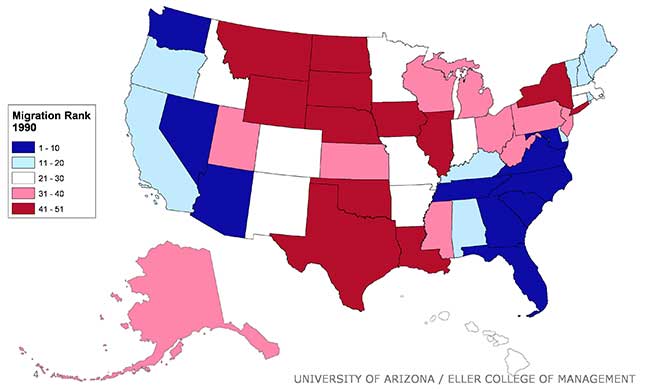
Exhibit 4: State Rankings by Quintile, 1990
(Census 1990)
Exhibit 5 shows the results for 2000, our last data from a decennial Census. Note that California falls into the bottom quintile, while the energy-producing states rise in the rankings. The states in the Southeast still do very well, in contrast to states in the Midwest and Northeast.
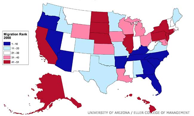
Exhibit 5: State Rankings by Quintile, 2000
(Census 2000)
Exhibit 6 shows the results from the ACS five-year estimate for 2005-2009. California remains in the bottom quintile, while the energy-producing states rise to the top quintile. Louisiana falls into the lowest quintile, due to the lingering impact of Hurricane Katrina. As usual, states in the West and South tend to rank higher than states in the Midwest and Northeast.
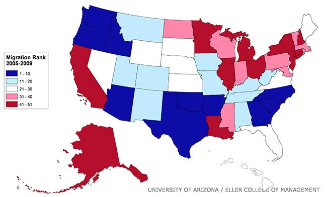
Exhibit 6: State Migration Patterns by Quintile, ACS Five Year Estimates 2005-2009
Finally, Exhibit 7 shows the latest results, for the ACS five-year estimates for 2008-2012. California remains in the lowest quintile, while several energy-producing states remain in the upper quintiles (Texas, Oklahoma), reflecting the energy boom. Indeed, the energy boom lifts North Dakota into the middle quintile. The states around the Great Lakes and in the Northeast remain in the bottom quintiles.
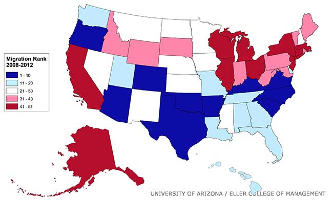
Exhibit 7: Arizona Remains in the Top 10, ACS Five-Year Estimates 2008-2012
Arizona remains in the top 10 throughout the period, reflecting the fact that the state is a relatively attractive migration destination. Nonetheless, the state was impacted by the Great Recession, with a decline in the state’s rank from second during the 2005-2009 period to 10th during the 2008-2012 period.
However, it is important to keep in mind that domestic migrants are probably not choosing to locate in the state in order to increase income. As Exhibit 8 shows, Arizona’s per capita personal income has consistently been below the national average during the period. In addition, the gap has increased rapidly lately. In 2013, Arizona’s per capita personal income was 16.8% below the nation and ranked the state 42th out of 50 states and the District of Columbia. Instead, migrants likely chose the state for other reasons, perhaps a climate that is dry and warm in the winter or rapid job growth. Exhibit 9 displays numerical ranking for all fifty states from 1970 through to the 2008-2012 period.
For more discussion of quality of life issues in Arizona in the context of how Arizona compares with other Western states and communities, please visit EBRC’s new Making Action Possible website! The MAP Dashboard’s goal is to promote data driven collective civic action and education in Southern Arizona. MAP tracks indicators across a wide spectrum of social and economic issues important to our community.
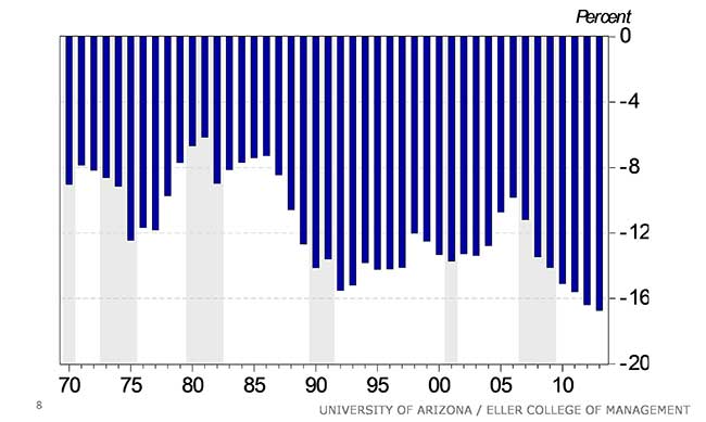
Exhibit 8: Arizona’s Per Capita Personal Income Increasingly Below National Average
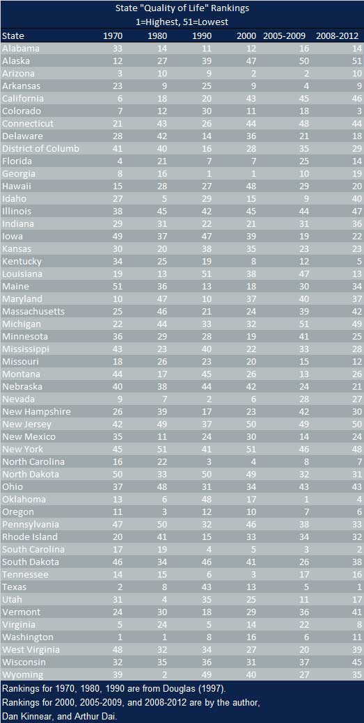
Exhibit 9: State “Quality of Life” Rankings
1Douglas, Stratford. 1997. “Estimating Relative Standard of Living in the United States Using Cross-Migration Data,” Journal of Regional Science, 37,3, 411-436.
Photo of shoes forming the letter V for vote on a sidewalk courtesy of Shutterstock.